Brand Identity
SF Fire Credit Union (75th Anniversary)
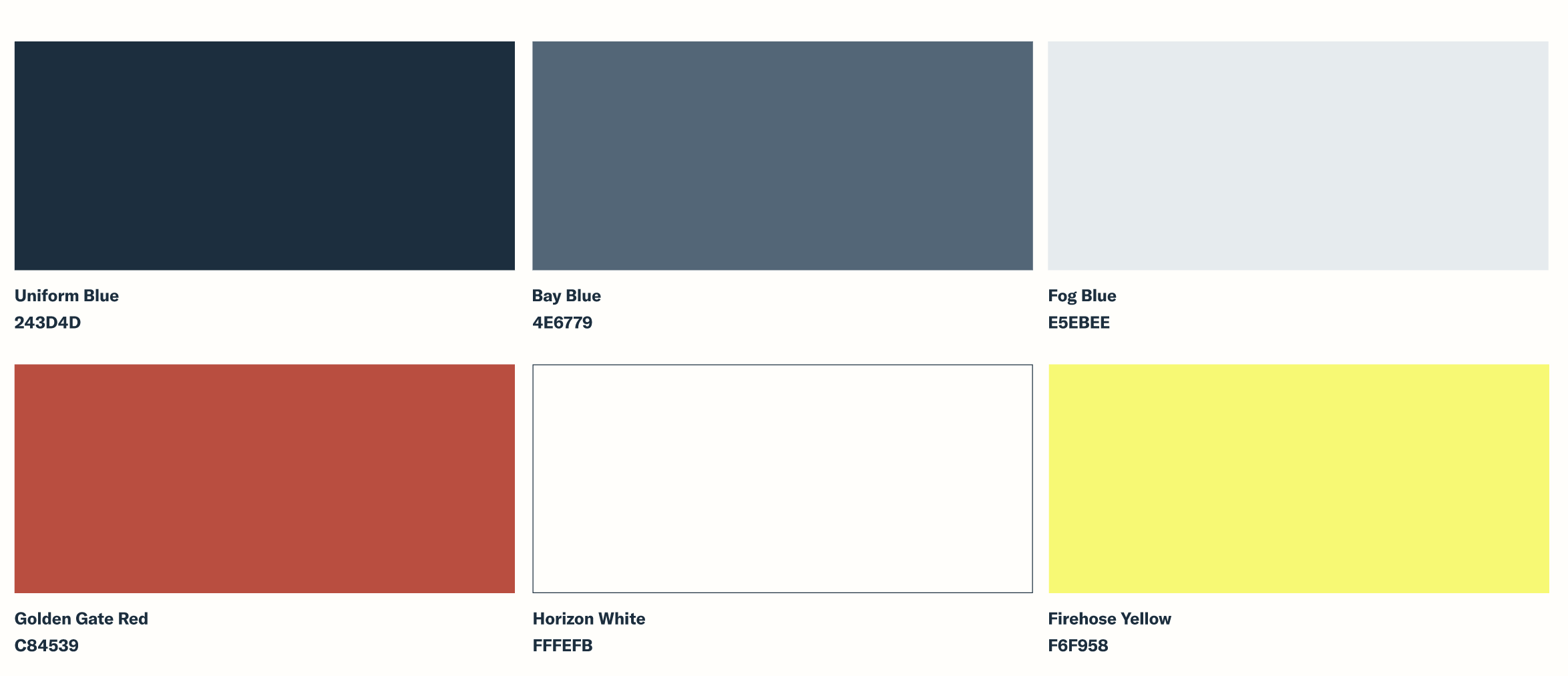
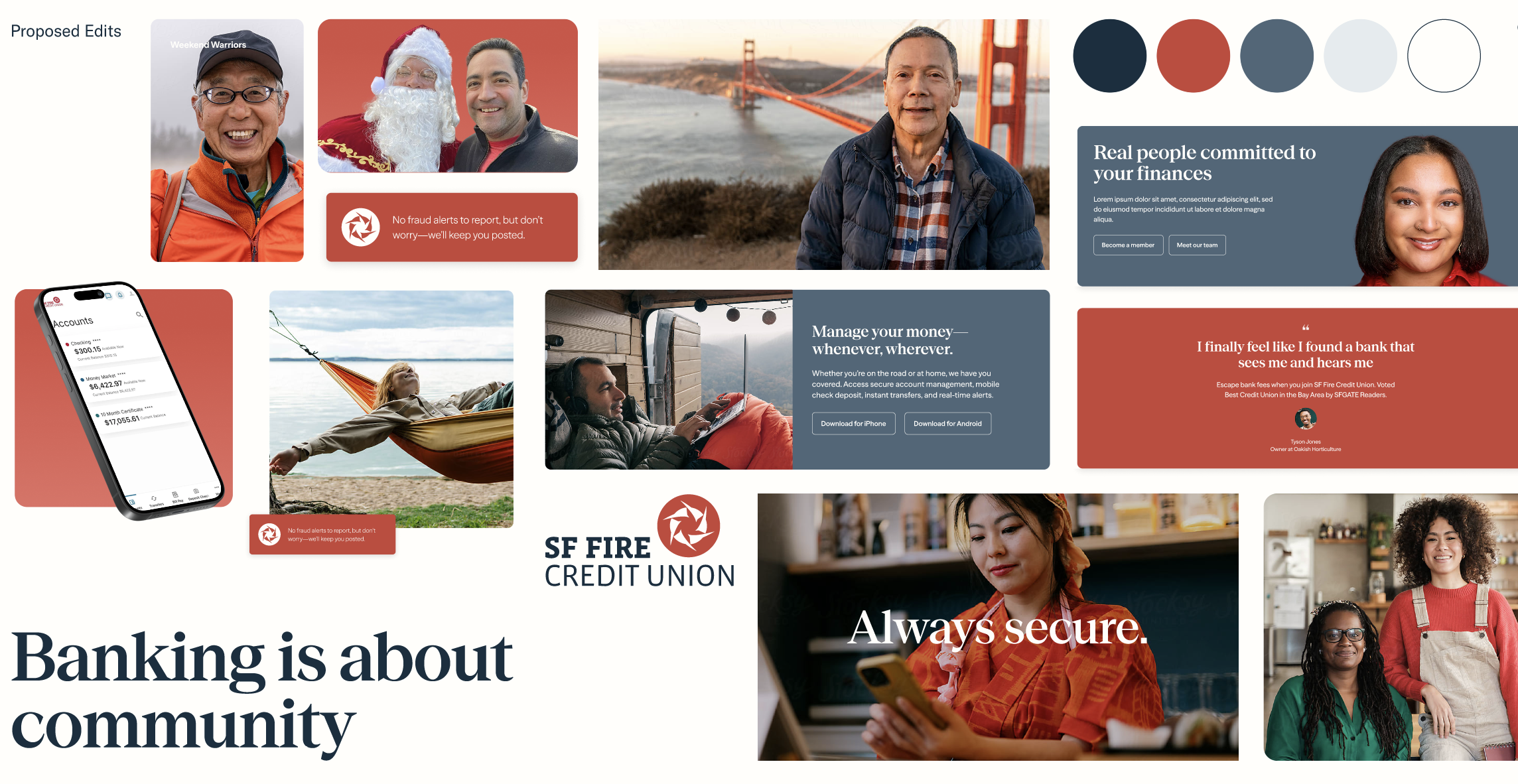
For SF Fire Credit Union’s 75th anniversary, I led a full brand refresh designed to modernize the organization while preserving the trust and familiarity members already knew. We simplified the visual system with a refined color palette centered around the brand red and Bay Area-inspired blues, creating a cleaner and more recognizable identity. We also introduced a modern serif typeface with soft curves and improved digital readability to give the brand a warmer, more contemporary feel across every touchpoint.
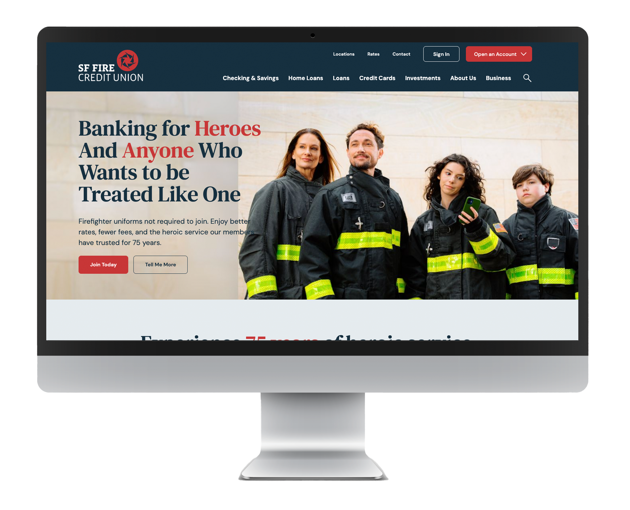
Alongside the rebrand, I directed the redesign of the public website, translating the refreshed identity into a more intuitive and conversion-focused digital experience. The work included updated UI components, improved mobile optimization, streamlined navigation, and SEO/GEO/AEO-informed content structure based on user behavior insights. We also developed and launched a phased communications rollout across internal teams, social, web, digital banking, and marketing channels to ensure a cohesive launch from day one.

SF Fire Credit Union (2019 Launch)
In 2018 we engaged with a brand agency to rethink and redesign the SF Fire CU brand. I was the project lead on the credit union side and worked closely with agency strategists and designers as well as in-house stakeholders (executive management and the board) to develop a concept that would help us stand apart from competitors and align with our growth goals.

Website (Desktop and Mobile)

Redesigned Logo (and alt)

Logo Design Inspiration (Including previous logo)

Mood board
First Responders Health Research Institute
Retired and injured firefighter Drew Aversa reached out to get help with a visual brand identity for his idea that would jumpstart mental and physical health research focused on first responders at the national level.


